You can build full-featured dashboards in SharePoint without Power BI. Counters, charts, indicators, filters, and rollups assemble into live operational dashboards that read directly from your lists, and with Ultimate Forms every one of them is configured in the browser without code. If your reporting question is "how are we doing right now," you do not need a BI platform to answer it.
In a previous article, we covered why so many SharePoint reporting needs never justify Power BI's licensing and modeling overhead. This follow-up gets practical: ten dashboards organizations actually run inside SharePoint, what goes into each, and how quickly you can have your own.
The building blocks
Every dashboard below is assembled from the same small kit of no-code Ultimate Forms components:
- KPI counters display a single live number: open tickets, overdue tasks, registrations today. The fastest path from list to insight.
- Charts render bar, line, pie, donut, and area visualizations straight from list data, with grouping and filtering built in.
- Color indicators and progress bars turn status columns into traffic lights that need no explanation.
- Filters let one dashboard serve every department: pick a team, a date range, or a status, and every component updates.
- Rollups aggregate items from multiple lists and sites into one view, so a dashboard can span your whole environment.
Because everything reads live from the lists, the dashboard is never stale and never needs a refresh schedule. Users click any number and land on the underlying items, in the same browser tab, with their existing permissions applied.
Ten dashboards, no BI platform required
1. Executive Dashboard
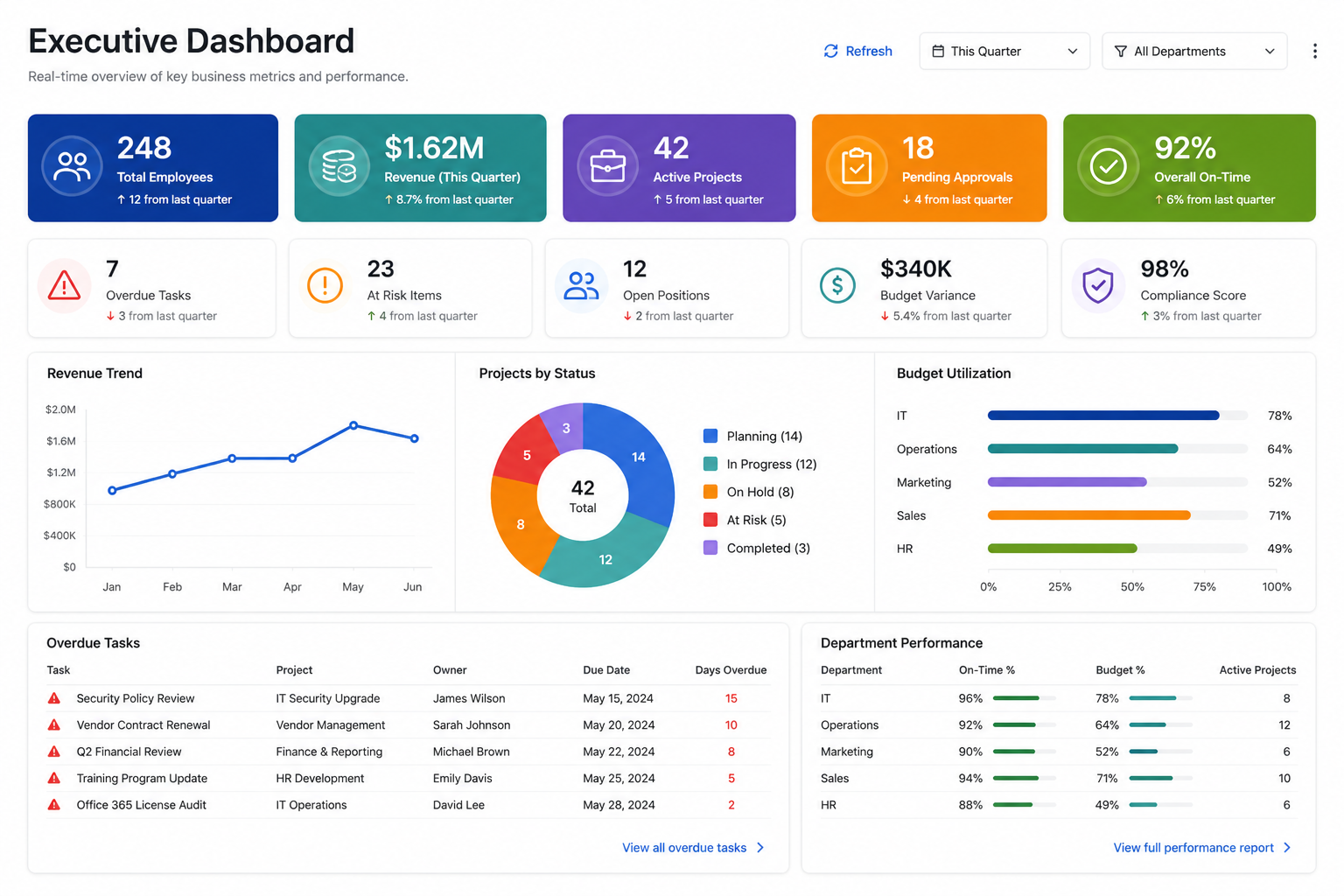
Leadership rarely wants detail; they want to know what needs attention. Combine counters for active projects, pending approvals, and overdue items with a budget utilization chart and department-level progress bars. The executive version of every dashboard below can live on one page, powered by rollups across sites. A CEO opening the intranet sees the state of the business in five seconds.
2. Project Management Dashboard
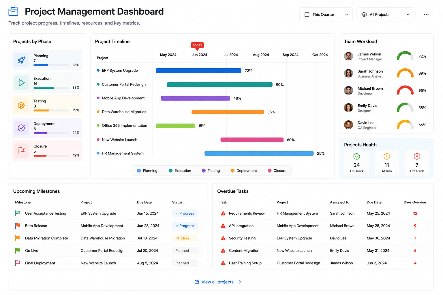
The classic. Projects grouped by phase in a bar chart, milestones due this month in a filtered view, budget consumed versus planned as progress bars, and a red-amber-green indicator per project computed from overdue task counts. Project managers stop compiling Friday status decks because the status is always on screen. Pair it with the Project Management template and the underlying lists come pre-built.
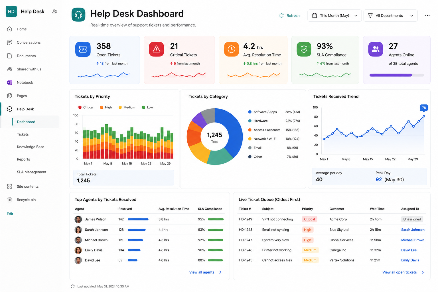
3. Help Desk Dashboard
Support runs on a handful of numbers: open tickets by priority, tickets due today, average resolution time, and per-technician workload. Counters across the top, a trend line of incoming requests below, and a color-coded queue at the bottom. When the "overdue" counter turns red, the team lead knows before the complaint arrives.
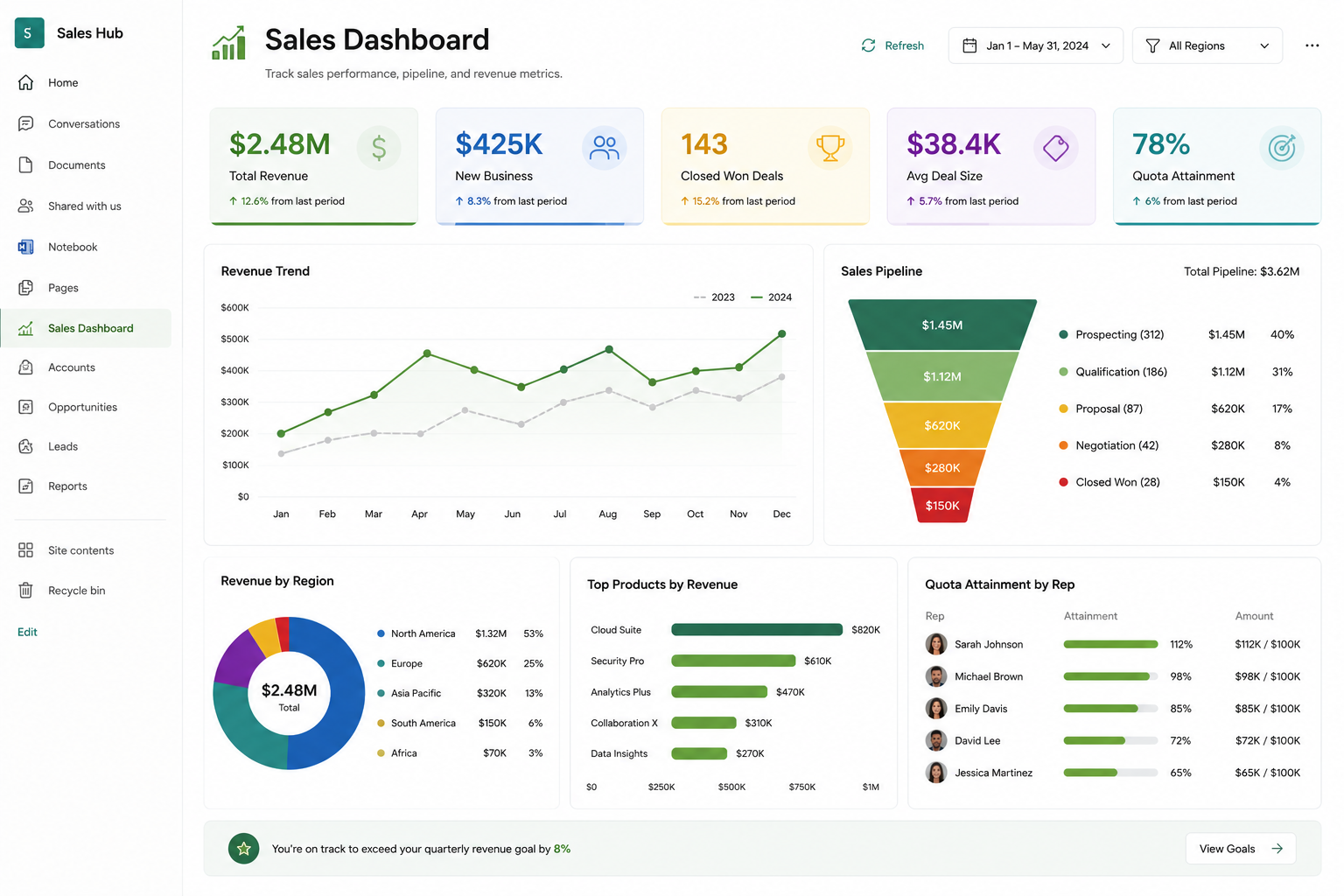
4. Sales Dashboard
Track sales performance without exporting data into external reporting tools. Display revenue totals, monthly sales trends, product categories, regional performance, sales pipeline metrics, and progress toward quarterly goals.
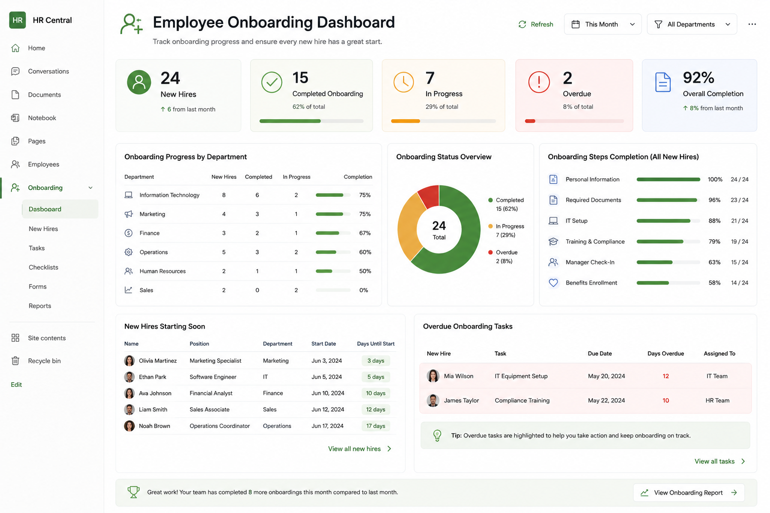
5. Employee Onboarding Dashboard
Onboarding spans HR, IT, facilities, and the hiring manager, which is exactly why it needs a shared dashboard. Show each new hire as a row with a completion progress bar, counters for tasks due this week, and an indicator for anything blocking a start date. HR sees every onboarding at a glance; each department sees its own queue through a filter.
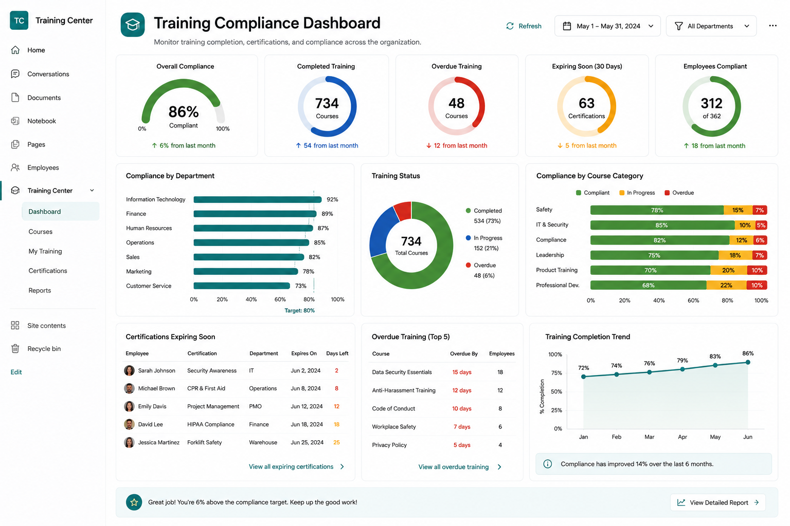
6. Training Compliance Dashboard
Compliance reporting is usually a quarterly scramble. A live dashboard replaces it: completion percentage per department, certifications expiring in the next 60 days, and overdue courses by employee. Auditors can be shown the current state on demand, and scheduled alerts chase the stragglers automatically between reviews.
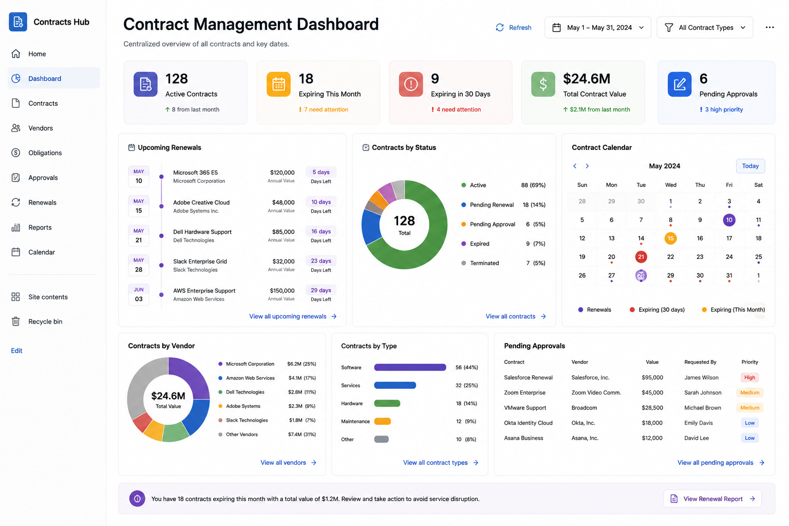
7. Contract Management Dashboard
Contracts fail quietly: a renewal date passes and nobody notices until the invoice arrives. Counters for contracts expiring in 30, 60, and 90 days, a chart of contract value by vendor, and approval-status indicators make silence impossible. The dashboard pairs naturally with automated renewal reminders, so the visual layer and the notification layer cover each other.
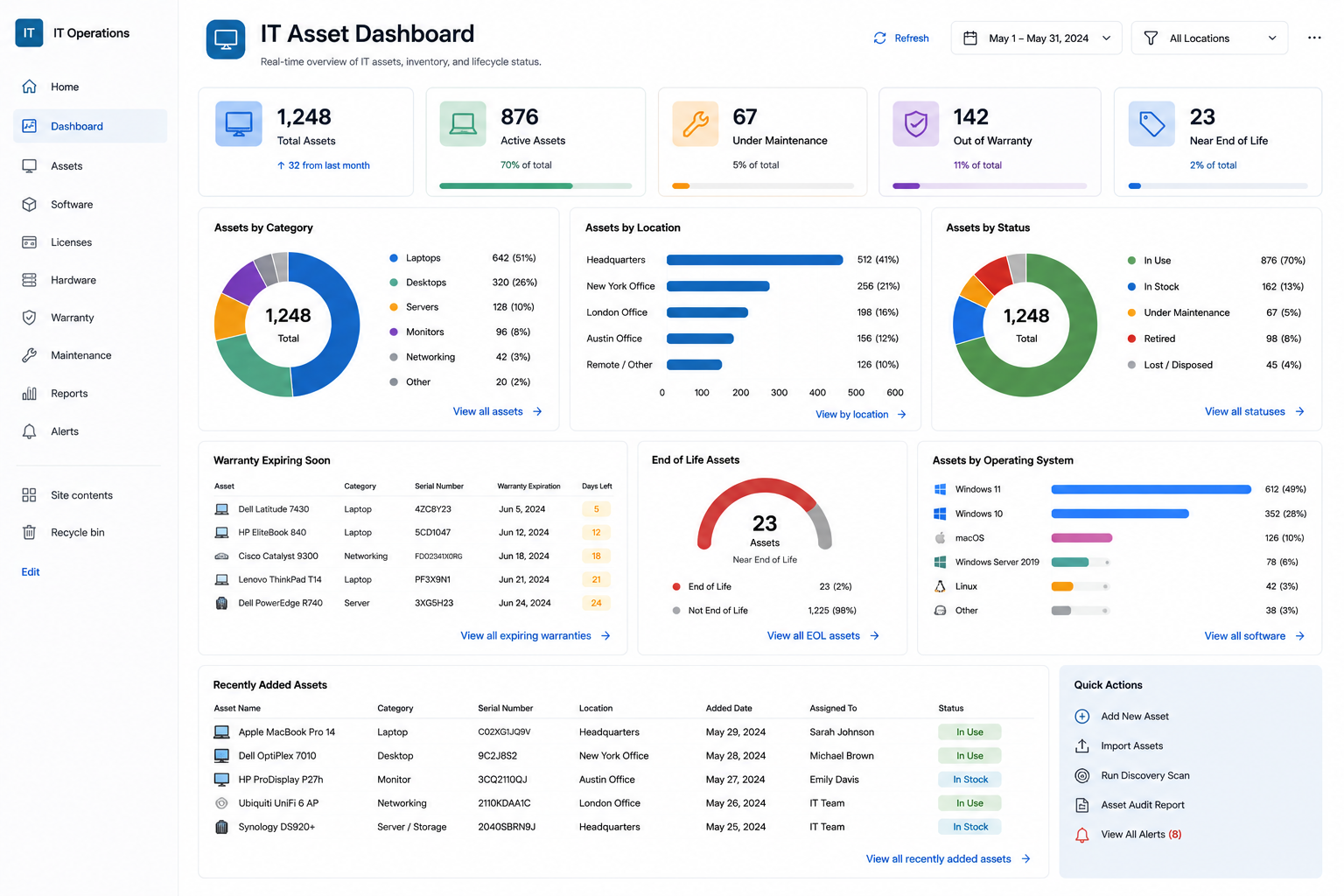
8. IT Asset Dashboard
Inventory by category, warranties expiring this quarter, license counts against purchased seats, and equipment assignments by department. When the laptop counter drops below the reorder threshold, purchasing knows without being asked. Combined with check-out forms, the dashboard closes the loop between assigning assets and knowing where they are.
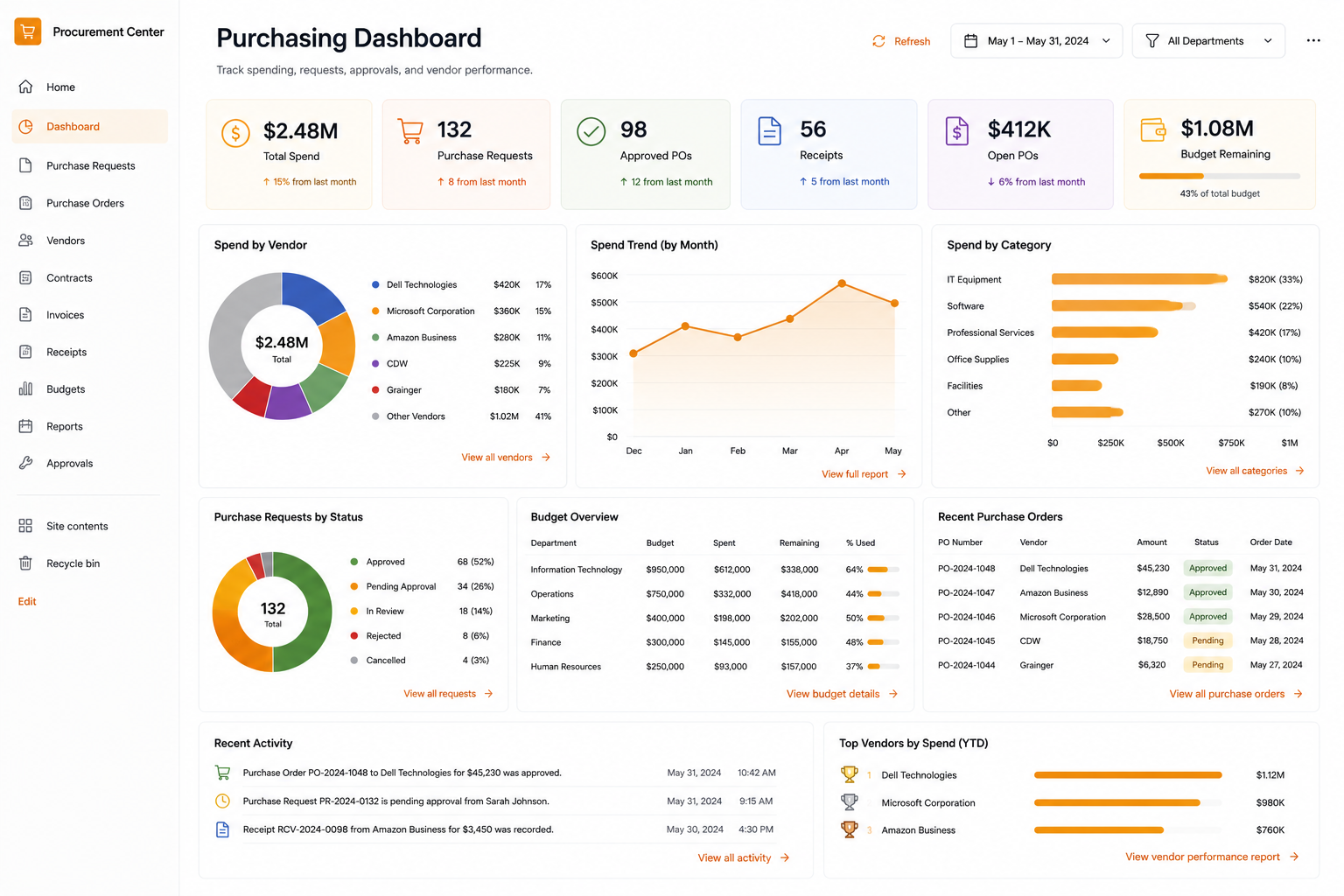
9. Purchasing Dashboard
Requests by status, approval bottlenecks (which stage holds the most items, and for how long), spending by vendor, and monthly purchasing trends. This is the dashboard that answers "how long do our approvals really take" with data instead of impressions, and it makes a strong case reviewed alongside approval cycle metrics.
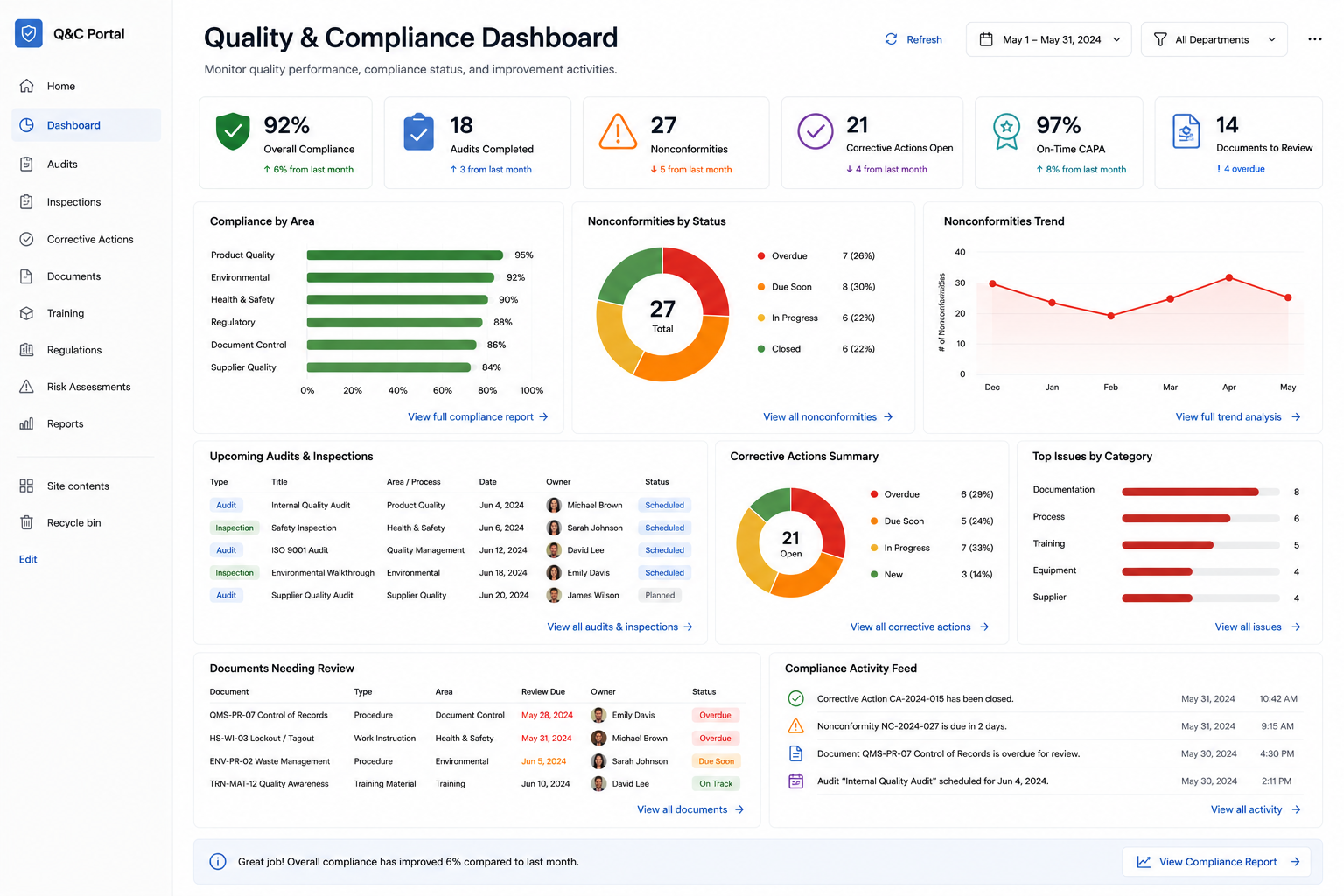
10. Quality & Compliance Dashboard
Open quality issues by severity, corrective actions past due, inspection completion rates, and policy acknowledgment progress. Regulated environments get the extra benefit of a permanent, timestamped trail: the dashboard reads the same lists the auditors will, so there is no separate "reporting truth" to reconcile.
How to build one in an afternoon
The pattern is the same for all ten:
- Start from the list that already holds the data, or install the matching template from the Solution Catalog (450+ available) to get list, forms, and automation pre-configured.
- Add counters first. Two or three key numbers deliver most of the value and take minutes each.
- Add one chart for the trend or breakdown people ask about most. Resist adding five.
- Add indicators and a filter, so status is visible per item and one page serves every team.
- Put it where people already look: the team site home page, not a bookmark nobody opens.
Most teams get a working dashboard in a single afternoon, then refine it as questions come up. Compare that with the typical BI request queue, and the trade becomes obvious.
When you do need Power BI
Fairness matters: Power BI earns its place when you need cross-system data modeling, heavy historical analysis, statistical visuals, or paginated reporting across data warehouses. If your analysts are blending ERP, web analytics, and finance data, use it. But if the question is operational, how many, how late, whose queue, trending up or down, and the data lives in SharePoint lists, a no-code dashboard answers faster, for every user, at no extra license cost.
The bottom line
The information your teams need is usually already in SharePoint. What is missing is presentation, and that gap closes in hours, not quarters. With Ultimate Forms counters, charts, indicators, filters, and rollups, SharePoint becomes its own reporting layer: live, drillable, permission-aware, and maintained by the same power users who own the processes.
Pick the dashboard from this list closest to your loudest problem and build it this week. Start a free trial or book a demo and we will build the first one with you.
Add your comment