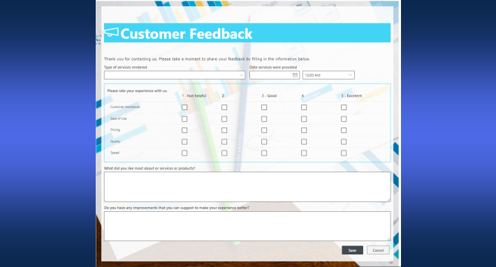
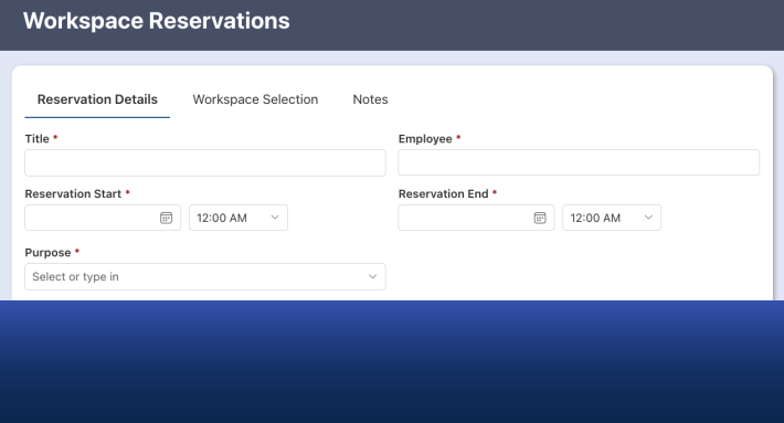
Every SharePoint form in Ultimate Forms has an adjustable width: a slider in the Style settings, from narrow 600px cards up to 1600px workbenches, with a live preview as you drag. The default of 1000px suits most forms, and mobile devices ignore the setting entirely, collapsing to a single column as always. What the slider really offers is a decision most builders never knew they had: matching the form's width to its content, which quietly changes how the form reads. This guide covers the setting, the width recipes for common form types, and how width interacts with the rest of the layout toolkit.
Why width is a design decision
Forms inherit their width from habit: whatever the platform defaults to is what every form gets, regardless of content. The costs run in both directions.
A five-column request form stretched across 1000px looks sparse and feels unfinished: single-line text boxes a hand-span wide for a ten-character entry, oceans of white space that read as emptiness rather than calm. Narrowed to 600px, the same form becomes a tidy card, the entries proportioned to their content, the whole thing takeable at a glance.
A dense intake form crammed into the same 1000px suffers the opposite way: many columns means either cramped side-by-side entries or endless vertical scrolling. Widened to 1600px on the monitors where such forms actually get used, the form breathes, five or six layout columns across, everything visible, nothing scrolled past.
There is also a readability argument that form design borrows from typography: very wide text entries are genuinely harder to review, because the eye loses the line. Multiline comment columns behave best at moderate widths, which is one more reason the simple form should not inherit the wide canvas.
The setting, in three clicks
The control lives with the other form-level styling:
- Click Styles on the command bar.
- Switch to the Style tab.
- Drag the Form width slider.
The preview updates as you drag, which makes the choice empirical rather than theoretical, slide until the form looks right, publish:
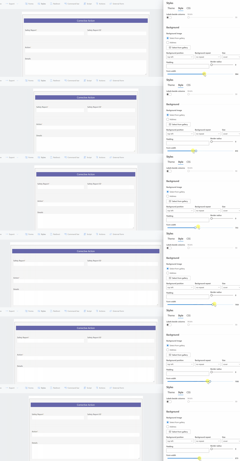
The fluid layout engine does the bookkeeping: as width changes, the columns inside each container reflow proportionally, sharing the available space equally with no per-column adjustments. And the setting governs larger screens only; below the mobile threshold, forms always render single-column, so a width decision made for the desktop never harms the phone, the same guarantee that runs through mobile forms generally.
Width recipes by form type
Treat these as starting points, then let the live preview arbitrate.
600px, the quick request. Five or so columns, one layout column, think leave requests, simple bookings, feedback. At this width the form reads as a card: compact, friendly, finished. The narrowness is a feature, signaling to the user that this will take a minute, not an afternoon.
800-1000px, the standard business form. The default range, right for most forms: a request with a dozen columns in two layout columns, a tabbed process form, anything general-purpose. When in doubt, stay here.
1200-1300px, the record form. Review-heavy forms, approvals, case records, registrations, especially with side-by-side labels, where the label column consumes width and the extra room keeps entries comfortable.
1400-1600px, the workbench. Dense intake and processing screens used by trained staff on large monitors: order entry with repeating sections, underwriting forms, dispatch boards. Five or six layout columns across, everything on one screen, scrolling minimized. The width that would overwhelm a casual user is exactly right for someone who lives in the form eight hours a day.
The pattern underneath the recipes: width should track the audience as much as the column count. Occasional users get narrow, legible, obvious; power users get wide, dense, efficient.
Width and the rest of the geometry
Three other controls shape the same space, and they interact.
Layout columns multiply with width: 1600px comfortably carries what 1000px cannot, so widening a packed form often beats splitting it, while narrowing a sparse one beats leaving one column adrift in space. The multi-column guide carries the pairing judgment.
Side-by-side labels consume horizontal budget: switching them on at 800px squeezes the entries, while at 1200px they earn their keep. Decide labels and width together, not in sequence.
Tabs trade width for height: a form that wants 1600px as one page may be two comfortable tabs at 1000px. Which is right depends on whether users need to see everything at once (the workbench) or work in stages (the process), and the tabs guide covers that fork.
A practical sequence for a new form: choose the layout columns from the content, set the labels from the audience, then slide the width until the preview stops arguing. Two minutes, and it shows.
Width where the form actually lives
A form's width meets its surroundings, and the surroundings vary. The same form can open as a full-page experience from the list, sit inside a web part on a SharePoint page, appear in a Teams tab, or run as a hosted external form on a public site. In each host, the slider sets the form's maximum width, and the host's own container does the rest: a 1300px form inside an 800px web part column renders at the column's width, gracefully, because the fluid layout treats the host like a smaller screen.
The practical consequence: set the width for the form's primary home, then check it in its secondary ones. A workbench form that lives full-page can afford 1600px; the same form embedded in a page's narrow column will quietly behave, but a quick look confirms the reflow reads well. For external forms, lean narrower than you would internally, public audiences skew toward laptops and tablets, and a 700 to 900px public form almost always outperforms a wide one.
Pick house widths, not per-form widths
One governance habit keeps a growing form library coherent: standardize two or three house widths instead of letting every builder slide freely. Something like 600px for quick requests, 1000px for standard forms, 1400px for staff workbenches, written down wherever your form conventions live, covers nearly everything, and forms of the same kind end up the same size across departments. Users feel the consistency without naming it, exactly as with shared styles, and the review question for any new form shrinks to "which of the three is this?", which is the right size for a question about width.
The habit worth breaking
The slider's real contribution is cultural: it breaks the default-width habit. Once width is a one-slider decision with a live preview, there is no reason for the five-column request and the fifty-column intake to share a canvas, and no excuse for forms that look rented rather than fitted.
It also makes an honest test available. Open your most-used form, slide the width down a notch, and watch the preview: if the form improves, it was too wide, and the fix just took ten seconds. Reversible, instant decisions like this are the cheapest usability wins in the whole design toolkit, and width is the one most builders have never touched.
Form width will not transform a bad form into a good one; structure, rules, and content do the heavy lifting. But a well-structured form at the wrong width still reads as slightly off, in the way a well-tailored suit in the wrong size does. The slider is the fitting.
Frequently asked questions
Add your comment