Business operations can live where SharePoint users already work: in the list view's command bar. In Ultimate Forms, enabling Manual execution on any action adds it to the Run Actions button, so "Close Ticket," "Engage," or "Flag as Bug" becomes one click on the selected item, or on twenty selected items at once, with no form opened and no code written. This guide covers the surfaces, the setup, the batch behavior that makes the command bar the home of bulk operations, and the design choices that keep the menu trustworthy. For the engine behind the buttons, see the automation guide.
The click that happens where the user already is
SharePoint automation grew up event-driven: actions fire when items are created or changed, or on timers. Events cover everything that should happen automatically, which is most of a process, but not its decisive moments. Somebody looks at a ticket and decides to take it. Somebody scans a view of feedback and spots the bug report. Somebody finishes a review and closes the record. These are judgments, and judgments need a trigger a human can pull.
The question is where the trigger lives, and the answer shapes the whole experience. If acting on an item means opening its form, editing a column, and saving, the three-step detour taxes every judgment, and users batch them up, postpone them, or skip the bookkeeping entirely. The command bar removes the detour: the user is already looking at the item in the view, the operation is one click away, and the view is where they land afterward, ready for the next item. The decision happens at the speed of reading, which, for triage-shaped work, is the difference between a live queue and a stale one.
The two surfaces
The command bar. Select one or more items in any list or document library view and the Run Actions button appears. Clicking it opens the popup listing the manual actions available here; clicking an action runs it, with progress tracked directly in the popup. The gesture suits both the in-passing single item, scan the view, select the one that needs attention, run the operation, keep scanning, and the swept-up batch.
The form. The same actions also attach to buttons inside the form via the Trigger action button type, for operations that belong at the end of reading a record rather than in a view. The two surfaces share the actions; only the placement differs, and a well-built operation is usually offered on the surface where its judgment happens, triage in the view, verdicts on the form.
Setting it up
The setup is one toggle plus choices. Build the action as usual, an Update List Items setting the status, a Send Email, an action group running several steps, and enable Manual execution in its settings. That alone puts it in the Run Actions popup.
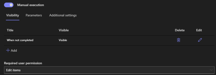
The manual settings then shape the experience. Choose an icon, so the operation reads at a glance in the menu. Set the permission level required to see the action, so "Delete and archive" never appears to users who cannot be trusted with it. Require a confirmation for consequential operations, one deliberate click between the user and the irreversible. Define parameters where the operation needs input the item does not have, a reason, a quantity, an assignee, collected through a generated form at run time. And add conditions, Status equals Draft, say, so the action only executes on items that qualify. On top of the conditions, visibility rules go one better: the button itself appears only for the right users and the right item states, so the Run Actions popup is already an honest list of what this person may do to this item right now.
One platform note: the on-premises version of Ultimate Forms carries additional configuration options beyond those available in SharePoint Online. Everything in this article works in both environments, so command bar operations built online transfer to on-premises estates and back, like the rest of the platform.
Batch: the command bar's superpower
Multi-select is where the command bar pulls away from every other trigger surface. Select a dozen support requests and run Engage once: each selected item becomes the action's current item in turn, each is updated, each logs its own entry in Action History. The operation that was a dozen form-edits becomes one gesture, and the consistency is structural, every item gets exactly the configured treatment, because the treatment is configured, not retyped.
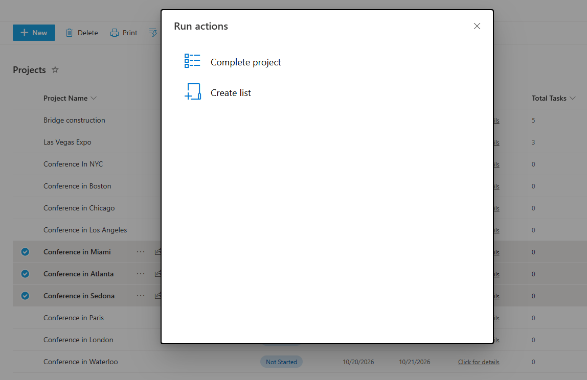
Two habits keep batch operations safe. Write the action's conditions to handle mixed selections gracefully: when a user sweeps up items in different states, the conditions decide per item, so the already-closed ticket in the selection is skipped rather than mangled. And for destructive or high-volume operations, the confirmation prompt earns its place, one "really?" before forty items change is cheap insurance against the mis-swept selection.
The operations worth installing
Triage verbs. The feedback list makes the pattern concrete: a "Flag as Bug" action sets the category and assigns the development queue; a "Request Follow-Up" action notifies the submitter. Reviewers work the view, select, verdict, next, and the feedback process gains speed without gaining steps.
Ownership moves. "Engage" assigns the ticket to the current user and sets the status in one click, the classic claim gesture for support queues. Its mirror, "Release," hands back. Both beat editing an Assigned To column, because the click carries the whole convention.
Stage advances. "Submit for QA," "Mark as Reviewed," "Close Ticket": each moves the record one legal step, and with visibility rules keyed to the status column, the command bar offers exactly the advances available from the item's current stage, the state machine pattern in its natural habitat. Where the step is a formal decision rather than a move, the approval machinery records it properly and the manual actions handle everything around it.
Operational one-offs. Regenerate the document, resend the notification, re-sync the external record: the maintenance verbs that otherwise become requests to whoever has admin rights. As manual actions they are self-service, permission-scoped, and logged, and the IT queue loses a category of tickets that never deserved to be tickets.
Designing a menu people trust
The craft, as with every button surface, is restraint and naming. Name actions for their consequence, "Close Ticket," never "Action 2", because the popup is a menu of promises and each label is read in half a second. Keep the list short per audience: permission scoping and visibility rules exist so that no user faces ten operations of which three are theirs. Prefer one action group over asking users to run three actions in order, the group owns the sequence and the halt-on-failure. And lean on Action History as the accountability layer: every manual run is recorded with who, when, and what, so the one-click convenience never costs the audit trail.
The result, installed well, is a quiet change in how a list feels. The view stops being a place to look at work and becomes the place to do it, one honest click at a time.
Frequently asked questions
Add your comment